Style Guidelines

Logo

Primary Logo

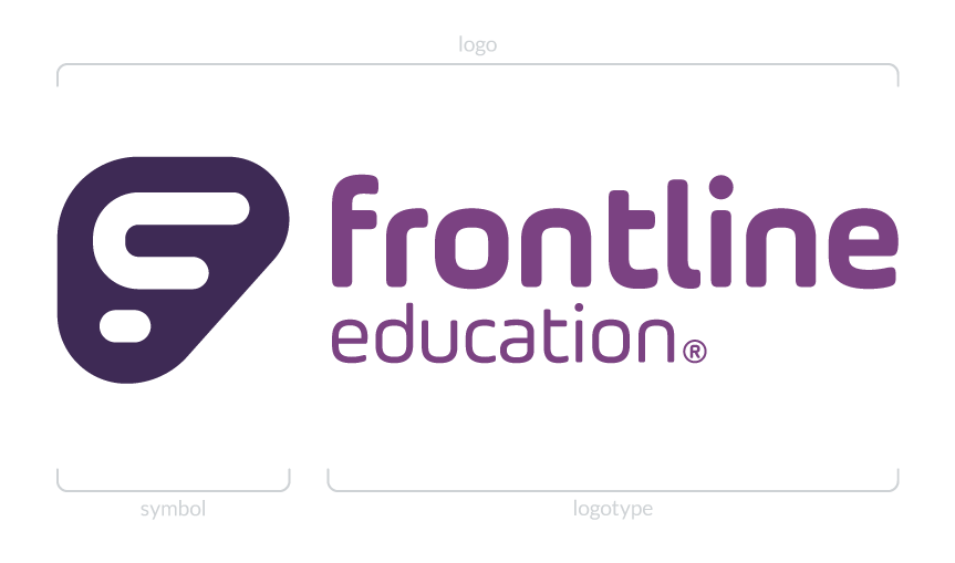
Our logo comprises the f symbol and logotype. While the symbol may be used independently, the logotype should never be used without the symbol. Use only versions of the logo provided by the Creative Team.
 

Clear Space & Minimum Size

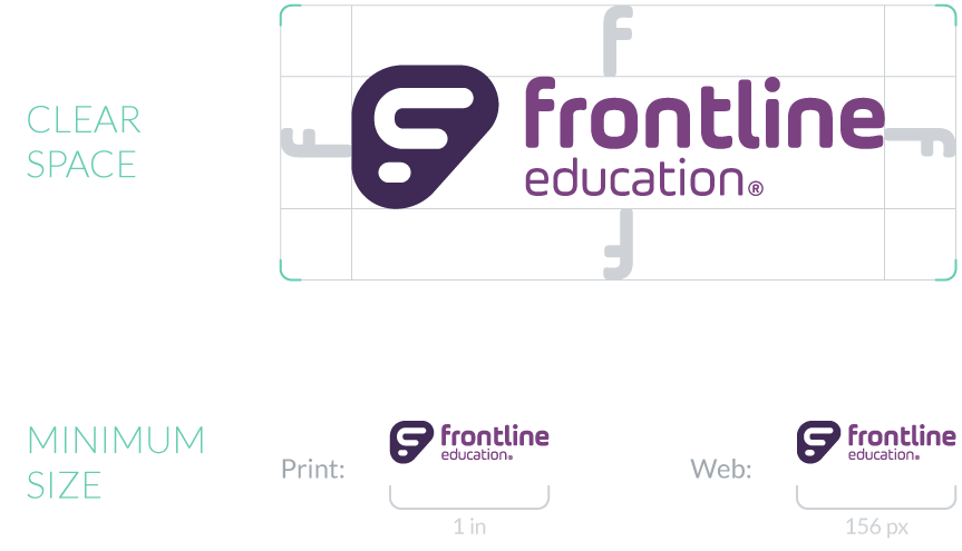
The clear space is the protected area around the logo that must be maintained to ensure no other graphic elements interfere with its clarity and integrity. It is also the minimum space the logo may be placed from any corner of an artboard in which it is placed.

Do not use the logo in sizes smaller than listed. This will cause the logo to degrade in quality and potentially become unreadable.
 

Our Symbol

“The symbol isn’t an artistic expression of the brand. It’s an emotive communication device that’s been used since the dawn of mankind. And it’s one of your most effective devices to stand out in a highly competitive, information rich marketplace.” – Jeremy Miller


The Frontline Education symbol is a stylized f monogram formed by our dot and line pattern, and held in a forward-leaning, wing-inspired enclosure. It is intended to symbolize the Frontline brand on its own or in combination with the Frontline Education logotype.

Logos and Color

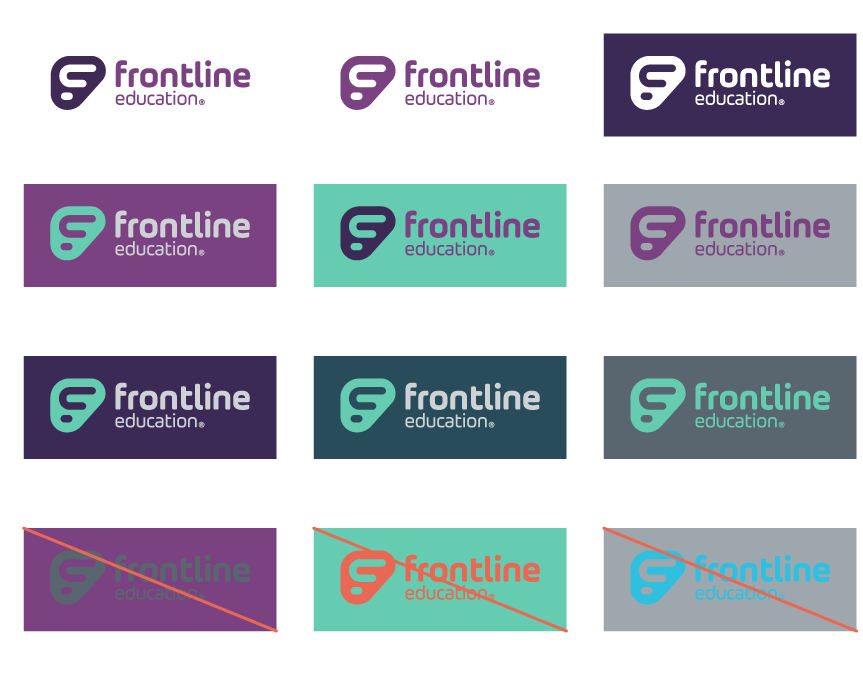
The logo is commonly displayed in our primary brand purples on a light background (see Color section), but may also be shown in other brand colors as approved by the Creative Team. The examples on this page are just a few of the color combinations that are permissible. Example: a white logo over a dark background is acceptable.

Logo Don'ts

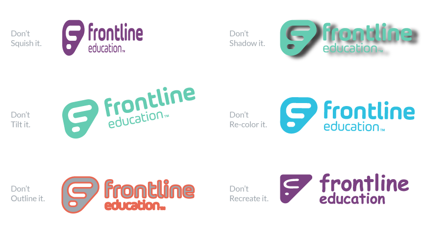
No. Please, No.

These are just a few of the ways you shouldn’t use the logo. If you are not sure if you are using the logo properly, please contact a member of the Creative Team. 

These guidelines also apply to the Frontline Education logo alternates and symbol.


Visit our Resources page to download our logo